Current Recommendations
_________________________
“Six Men” by David McKee
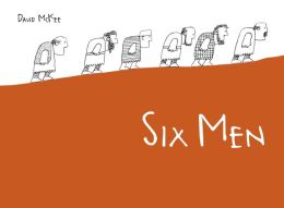
Author: David McKee
Publisher: North
South, 2011
The author/illustrator, whose career spans nearly 50 years of published work, is perhaps best known for his work brightly colored, highly geometrically patterned art, featuring Elmer the Patchwork Elephant. This pachyderm has won the hearts of children who delight in the simple stories.
Here, McKee turns his
attention to a serious allegory. The new book is indeed, as dictionaries tell
us, “abstract meaning presented through a concrete form.” The six men are
sharply differentiated as they go around the world looking for a place “where
they might live and work in peace.”
The men at first succeed, until their worries about unknown
enemies lead them to greater and greater heights of folly. Indeed, this
escalates to a point where there are actual enemies facing each other across
the great river. At the end of this confrontation, there are just six men on
either side who turn away to resume their original search.
The sharpness of the ink pen lines juxtaposes many different
patterns, though there are large areas of blank space in a contrast that sets
off the details. Some of the art is conventionally arranged on the page, i.e.
the viewer looks directly at eye level, but in several cases, McKee takes an
unusual view point. Sometimes the viewer must look top down, sometimes look
closely at the tiny figures in panoramic views, and in one of the openings must
figure out the split screen effect. All of this is done without the saturated
color so characteristic of much of McKee’s work. Indeed, he even eschews shades
of gray. All we have is simple, intense, sharp line to provide an equally sharp
comment on the folly of war.
"numero" by Marion Bataille

Author: Marion Bataille
Publisher: Chronicle, 2011
What is a book? That seemingly
simple question has been defined many different ways. Usually we think in terms
of pages bound within a cover. Physical details can vary greatly: size, shape,
direction (horizontal or vertical), interior contents (pictures or not), story
or not. We have had alphabet books, many without any story, and number books,
many also without a connected story line.
The
last matter brings us to this book. Contained within a bright yellow slip case,
its title is presented in a bold black san serif lower case font. The first
opening contains a single numeral, a zero. The second opening contains just a
single numeral, 1. Flip to the third opening and Bataille's imagination becomes
apparent: using the 0 and 1, she creates a three dimensional numeral 2 out of
just the zero and the 1. When opened to this page, the popup features make the
2 visually. Similarly, on the next opening, just the 1 and the zero create a 3.
And so it goes, using just the two basic elements she first introduces, she
leads viewers on a journey to 10.
The purposely minimalist approach
would have made architect Mies van der Rohe proud! (www.greatbuildings.com)
is a useful resource to understand his idea and her visual interpretation of
his assertion, “Less is more.” Bataille is clearly in tune with his famous
maxim, The use of the supportive device of popup strips which contain no
content of their own but rather simply provide the way to have the numerals
line up visually to create each one is impressively clever.
A way one might use this book with
intermediate grade children would be to share it with them. Then challenge them
to see what they could create using cardboard support platforms to create a
visual image that becomes understandable when viewed from a distance but retain
their individual components. Creating illusions is, after all, what most
electronic media are about.
Click here for
Purchase and Inquiry.
"Night
Light" by Nicholas Blechman
 Author: Nicholas Blechman
Publisher: Orchard
Books, 2013
Reviewed by: Sandy Brehl **
The first is NIGHT
LIGHT, created by illustrator, designer, and art director Nicholas Blechman.
It works beautifully as a concept book that is anything but simple. Double page
spreads alternate from full-bleed black to full-bleed vibrant colors. Black
spreads present a simple left-page number riddle and a corresponding right-page
cut-out revealing a punch (or punches) of pure color, progressing from one to
ten. These black spreads turn the page to double page spreads revealing left-pages
providing the correct word and a "re-application" of the punchout(s)
suited to the response. Right-pages reveal visuals of the correct response
within a double-page scene rendered in bold, crisp-edged abstract forms.
This is a concept book that just keeps on giving, depicting many
forms of transportation, offering opportunities to count not just lights and
punchouts but other geometric forms and the figures they comprise, and inviting
discussions using words related to color, position, size, and shape. Each
response page suggests a story of its own, including the endpapers.
As if that's not enough of a good thing, the font throughout is
formed as if by the iconic Hasbro LITE-BRITE toys.
The final pages switch back to one light, glowing through the night, with a
page turn to a boy in bed reading this book, seated in a
car-type bed, with toy-sized versions of each vehicle scattered around his
room. In a very real sense this is a bedtime book, too.Constructed on very
heavy stock with sewn binding it almost has a board book quality to it,
including the flat full opening of each page.
** Review can also be found at: http://unpackingpicturebookpower.blogspot.com/2013/06/two-books-about-night.html
"The Day the Crayons Quit" By
Drew Daywalt
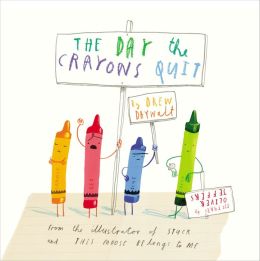
Author: Drew Daywalt
Illustrator: Oliver
Jeffers
Publisher: Penguin,
2013
It’s a delicious pleasure to receive a really imaginative promotion piece from a publisher. The creativity in the boxed quasai- Binney and Smith crayon box heightened anticipation for the book to come soon after. Though not mentioned name, the producer of those much loved boxes of crayons presented a memorable visual image over many years. Opening the cardboard box, replete with rows of points was an inspired way to introduce the book. Kudos to the packaging designer.
Each of the crayons is
dissatisfied with some aspect of their life, each express their concerns in a
letter to Duncan, their owner.
Personifying colors
might seem a difficult task but using first person narration, in letter format,
evokes the many needs the crayons express. Over-used red needs a rest. Purple
despairs over not being used within the lines. Beige wants his right name used.
Grey pleads for less work, being tired of all those elephants while white seeks
to become more visible. Black resents being limited only to outline. Green is
very satisfied but pleads for his friends yellow and orange who are arguing
over who should do the sun. Blue appreciates being the favorite, despite worry
about being worn down to a stub. Pink pleads for genderless lack of
restrictions. Peach, wrapper-less, signs his letter, “your naked friend.”
Each page makes
effective use of much white space to set off the purposefully childlike art
from illustrator, Jeffers, who asserts his favorite color is “striped.” Format
involves a letter on the left side of each opening as the individual colors
raise their complaints. The right side of each page features the illustration
by the crayon-author.
In the end, imaginative Duncan devises a way to keep them all happy.
In the end, imaginative Duncan devises a way to keep them all happy.
Click here for
purchase and inquiry.
"Open This Little Book" By Jesse
Klausmeir
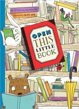 Author: Jesse
Klausmeir
Author: Jesse
Klausmeir
Illustrator: Suzy
Lee
Publisher: Chronicle
Books, 2013
The idea of changing
page size within a book isn’t new. Eric Carle did
it in The Grouchy Ladybug (Crowell, 1977). Another example is
Lois Ehlert’s, Planting A Rainbow (Harcourt, 1988) in which her
pages expand as the plants grow. This is described in, Looking At
Picture Books by John Stewig (Highsmith Press, 1995), P147.
Here, the pages first
diminish in size until they become a miniscule 2” by 3 “and then return to full
size 7 ½ “ by 11 “. Lee has readers begin with opening a red book and
subsequently the red lady bug opens a smaller green book to show a frog who
opens a smaller orange book and so it goes. At the conclusion of the shrinking,
a giant (a little girl) can’t open the book because of its small size, so the
story reverses through each of the color books and the animals which help with
them. At the end she is sitting reading surrounded by her many friends who
helped open and then close the books. Lee’s vividly color cartoon style art is
defined by a firm black pen line.
For purchase and inquiry
click here
____________________________________
Note: This was given an Honor Book Award by, The Horn Book, January/February, page 30.
"Again!" By Emily Gravett
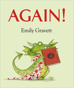
Publisher: Simon& Schuster, 2013
Dragons seem to hold continuing interest for children. This particular very green dragon is so fond of a book that he wants to hear it over and over. We are introduced to Cedric on the front end papers as he prepares to go to bed. His equally green mother reads him a book about a bright red dragon, Cedric, who among other things grabs princesses to turn them into pies. The double page spreads provide impressive visual space. Mother dragon, for instance, in stretching across the first opening is nearly 14 inches long. So long, indeed, that her tail extends off the side of the page. When the reader and listener reach the refrain “TOMORROW I’LL DO IT ALL OVER AGAIN.” The ample use of completely plain white space helps to crisp up the intensity of the red and green colors the artist uses. We turn the page to find little dragon holding up the book and the single word, Again?
The device of having the
little dragon hold up a book, the cover of which is the same as the cover of
this actual book is a clever idea. When mother dragon does in fact read on the
next page, it’s slightly different text she reads from the book. We see the red
dragon book character taking a pie to Trolls, but it must not be the princess
we saw earlier because she is shown at the top of her tower.
The refrain is repeated
and this time, a little more obstreperous Cedric pulls on his mother’s tail to
declare AGAIN! The next opening the text on the book being read says that
Cedric has made friends with the dragon and the refrain is “TOMORROW I’LL READ
IT ALL OVER AGAIN.” On the next opening baby dragon declares AGAIN twice, in
large capital letters. The humor on the next page is that it is Mother dragon who
has fallen asleep. This necessitates that little dragon, now red with
annoyance, declares AGAIN three times in even larger letters with exclamation
points. On the following page he is holding the book and looking at it himself
amidst seven AGAINS! It is all too much and on the last opening as he shouts
out a large “AGAIN”,he burns a hole through not only the book depicted in this
book but through the end papers and out the back cover with appropriate
charring on both the back flap and the back cover. On the back half of the
jacket we find the princess, arms akimbo at her waist in annoyance looking up
at the hole in the book. She has made it through every opening safely, but
there is no particular commentary about her.
The clever visual device
of changing from white through a placid green when we first meet little dragon
to the bright red/orange artist Gravette depicts him in, in the peak of the
action shows his anger. This is fully reinforced with the increasing size of
the motif word.
For purchase and inquiry click here
"The
Happy Owls" By Celestino
Piatti
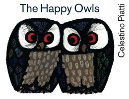
Author: Celestino Piatti
Publisher: North South, 2013 (1963)
The
publisher has done an impressive service to teachers and librarians who valued
the utter controlled simplicity of this art when first published. Heavy,
angular black lines carve the highly saturated colors from the intensely white
pages, stark in their bold visual statements, largely devoid of unnecessary
backgrounds.
The
simple text, set in a san serif typeface on an otherwise empty page, is a
reiteration of Piatti's belief that indeed, "less is more." The power
of the book and its simple message is due to the fact that there is nothing
unnecessary in either art or words. The message is as true today as it was when
the book was first published. Some people who live in harmony with the cycle of
seasons can rest content. Others, immune to anything other than the pleasures
of life, can never be happy. Heavy, but understated message. Piatti simply
tells his allegory and let’s readers take what they will from it. The book ends
with a helpful brief summary of the history of this book, and of Piatti's(1922-2007)
life and work.
What can be said about the
nature of Piatti's line? A very helpful comment was offered by Marsha Brown,
herself a three time Caldecott award winner, writing in her book (Lotus Seeds.
Children, Pictures, and Books,Scribner's,1986,1949).
Writing
about the character of lines and the way line influences the overall character
of a book, Brown comments about the "blunt and monolithically
emphatic..." ( pg.125) nature of his line which pervades Piatti's work.
Click here for Purchase
and inquiry.
“The Apple and the Butterfly” by
Lela & Enzo Mari
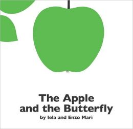
Author: Lela and Enzo Mari
Publisher: Penguin, 2013 (1969)
When this first appeared nearly 50 years ago, it was a striking contribution to children’s literature. The relatively small square shape is filled with a lot of empty space. The bright white coated paper contrasts so dramatically with the purposefully limited color scheme: intense green, red, brown and black. Big, bold, sharp-edged flat shapes are skillfully balanced against much smaller areas of detail, finally drawn black pen line detail telling this wordless story. Kudos to the mass market, Price Stern Sloan, an imprint of Penguin for making this important book available again.
Click here for purchase and inquiry
"Round is a Tortilla. A Book of
Shapes" by Roseanne Greenfield
Thong
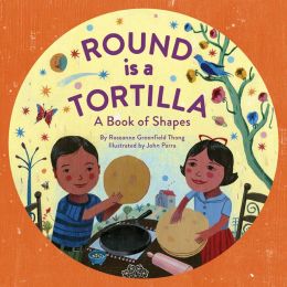
Author: Roseanne Greenfield Thong
Illustrator: John Parra A Book of Shapes
Publishers: Chronicle, 2013
Parra, winner of The SCBWI the Golden Kite award as well as a Pura Belpre Illustrator Honor, here provides decoratively patterned flat shapes in highly saturated colors to accompany the story. There is a very helpful glossary at book’s end so that children can learn such words as campanas, suenos and entanas. Thong provides examples (tortillas and pots are round) and then asks children if they see other things in the art which illustrate whatever shape is being discussed. Having children find other objects in their classroom which are the shapes or perhaps drawing pictures of other objects would be helpful follow up to enhance the awareness of shapes in our world.
"The Lamb and The Butterfly" by
Arnold Sundgaard
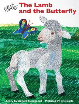 Author: Arnold Sundgaard
Illustrator: Eric Carle
Publisher: Scholastic, 2013 (Orchard,1988)
Publisher: Scholastic, 2013 (Orchard,1988)
There is probably no better-known illustrator working today than Eric Carle, so the decision to bring out a new edition of this well loved tale of two friends is clearly an easy decision to make. The artist's usual tissue paper collages, with paint stroked on and scribbled away feature the sharp scissor cut outlines his fans recognize immediately. The flowers are vibrant with saturated color, and the deep hued pattern on the butterfly wings are engaging.
The simple message is likely not lost on young listeners, though Sundgaard doesn't belabor his point- one should be content with what one has and not wish for what cannot be. Fortunately, this is never stated directly, so children may simply take an intuitive delight in the art itself.
An Interesteing experience to do with children who are used to exploring variation between books would be the following. Though the two editions of this are virtually the same size, children could be helped to notice that beginning on the jacket, the color and size of the font vary between the two editions. The title page is considreably different in these two features as well as in the page layout itself. Throughout the book, the text falls in the same location though the new text, printed in a san serif font, occupies a quite different amount of space on the page. The coated paper in the new edition provides a very differnt experience than the matte finish paper in the earlier version.
Click here for Purchase and inquiry
Previous Recommendations
_________________________
“Birds
of a Feather” By Francesco
Pittau & Bernadette Gervais
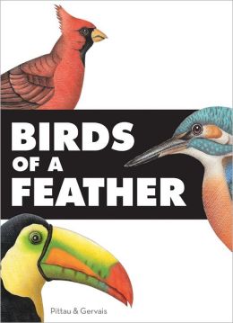
Publisher: Chronicle,
2012
Producing a book notably
outside the range of conventional standards always represents a significant
commitment on the part of any publisher. So, this publisher’s investment in the
wonderfully oversized (11 ¼ W 15 ½ H) indicates a willingness to forge into the
unexpected. What an exciting visual object has resulted: throughout the book
double page spreads stretch to a full 22 ½ inches wide, allowing a panoramic
canvas on which the many lift flaps entice readers and viewers to see what lies
beneath.
The opening spread
features exciting white silhouettes on a black background. When flaps are
lifted, the four birds featured on this opening are revealed in vivid colors.
We learn about crane behaviors, about ostriches ‘running speeds, about changing
colors as flamingos age and the practicality of herons “especially long toes.”
The next opening with black silhouette on white cardboard liftable flaps
introduces emperor penguins and cockatoos, also shown beneath in full color.
The pattern changes on the next opening, with 6 smaller full color liftable
flaps which open horizontally not vertically. The next opening reveals 16 eggs
of amazing variety in both color and size. When these are lifted; each of them
reveals a small pop up of the bird which produced the egg, and sentence or two
about the bird.
The next opening brings
back a visual memory of Graham Oakley’s Magical Changes(Atheneum,
1979) in which pages cut horizontally need to be flipped from right to left to
make the picture visually correct. Here we have six horizontal flaps which need
to be aligned in order to make the depiction of the great white pelican and the
toucan accurate. The last opening features four flaps in vivid black flaps cut
in the pattern in conventional picture puzzles. Each of the four flaps has a
small round peek hole revealing part of the bird underneath. Lifting all four
of the left flaps reveals the full color art showing a barn owl with
information printed in a san serif white on the black. On the right side of the
opening the Eurasion eagle-owl receives the same treatment
It’s clear that a lot of thinking and planning was combined with the skills of
both the artist and the art director. The reflection of the technical research
necessary to learn about the birds is impressive art and equally impressive
design skills. Some may feel the limited amount of information leads to
superficiality (https://www.kirkusreviews.com/book-reviews/pittau/birds-feather-pittau/).
The other point of view is that a sentence of two may tantalize a child reader,
with adult guidance to seek out a more complete treatment. A previous book by
this author/illustrator team , Out of Sight (Chronicle, 2010)
offers the same visual approach.
Click here for purchase and inquiry.
“Stories
1, 2, 3, 4.” by Eugene
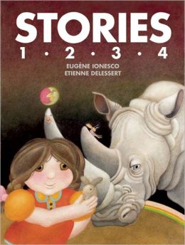 Ionesco
Author: Eugene Ionesco
Illustrator: Eitienne Delessert
Publisher: McSweeney’s
Publishing, 2012**
This publisher is providing
a very valuable service in making available once again the writing of Ionesco
(1909-1994) and the art of Delessert (b: 1941). Comparing the current version
of these stories with one of the originals reveals some very interesting
variations of scale, pictures and words. Looking at my original 1970 edition of
the Story Number 2 (Harlin Quist, Inc.) the first thing apparent is that the
new edition is approximately an inch less large in both width and height. There
are some interesting color differences which might intrigue visual artists. For
example, on the first opening the new edition is less intensely orangey-brown
and the wall behind the cat’s head is a greyer purple.
Looking at the flower
fan the mouse holds, and the clock faces in the cat’s eyes, we see the details
are less sharp.
There are minor wording
changes, i.e.: “That morning” in the new edition compared with “One morning.”
There are some deletions “Josette knocked at her parents’ door. Mama had left”
new, compared to “Josette knocked on the door of her parents’ room.” The
constant word play in which Papa substitutes one word for another is certainly
imaginative, though it might well be confusing to some literal minded children.
(The rug is called a lamp, the ceiling is called floor, the floor is called
ceiling), Certainly, despite the assertion in the original edition for that the
story is for children under three years of age, one might really wonder about
the author’s understanding of children’s language development.
These stories are still
a delight for adults interested in either writing or in creating illustrations.
Kudos to the publisher for making them available again.
*See Amy Martin’s Symphony
City in this section of the blog for another particularly impressive
design effort by this publishing house. As in the Martin book, the publisher
makes available on very high quality paper, a dust jacket printed on both sides
which unfolds to nearly 24 inches square.
Click here for
purchase and inquiries
Colors
It
is certainly noticeable that the element of color is one of the major
components of book design at this time. At the beginning of publishing for
children, black and white and resulting gray tones were the only choice.
Subsequently publishing moved into the kind of limited color printing available
to such creative artists as Evaline Ness. Still more recently full color has
become a perceived necessity, with very few artists purposely choosing a
limited color palette. Today very few artists purposely choose a limited color
palette. Most children’s books are ablaze with color so here we examine books
which focus on color as a design element.
As every season brings
changes in color in the physical world, so every season brings one or several
new books about colors. Some of them are wonderful, some interesting and some
forgettable Here we have four board books and two picture books, each different
from the other and probably intended for different audiences.
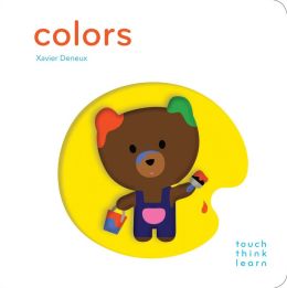
Colors by Xavier deneux
(Chronicle Books 2012) is in a small square format among the most vivid of the
books reviewed here. On each opening the left side features a raised cutout
providing tactile experience. Facing across the gutter to a cut out opening in
a different color, for example on the green page, the very simplified raised
leaf shape is on a white back group facing across a green page with a white
dye-cut opening. A single word on each page suggests a preschool audience which
will delight in the additional small characters like the caterpillar crawling
up the green leaf. Use the very last opening for the purpose of pointing out to
children that here when the yellow balloon overlaps the blue balloon something
happens ie: we get a green. Ways to launch into having children mix their own
colors.
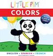
Physically, the biggest of the board books is the Pantone Colors (Abrams Appleseed 2012) which features on each opening twenty of the colors with their commercial name and their code number. Simple , two-dimensional objects using some of the colors face the grid page on the left. A green frog faces the twenty greens, and some children who respond to a visual challenge may enjoy pointing to part of the object and finding the corresponding square on the facing page. The back endpaper illustrates a variety of other small objects, clustered together by color family.Little Pim Colors by Julia Pimsleur Levine (Abrams Appleseed 2011) sets child readers/viewers looking for a particular color under the flaps, or revealed by the slides on the facing pages. The hide-and-seek quality of this will engage younger children, but older ones may be intrigued by the Spanish and French words which are provided in addition to the English words for the colors.

Colors (Orla Kiely, Holt 2011)
features simple objects, sometimes solid, other times in outline or just
silhouettes. Like the Pantone Colors book, this does provide a
variety of shades, here in strips down the right-hand side of each opening.
These are more effective in some of the colors, i.e. the green, than in the
black, where the shades are almost indistinguishable from one another.
Unlike the board books,
the two picture books each provide a continuous story line. Pirate Nap (by
Danna Smith, illustrated by Valeria Petrone, Clarion 2012), a couple of
imaginative children fight outside, inside, under the sofa pillows and at the
end of the day of “being pirates” are happily tucked in bed by mother. Prolific
Ashley Wolff presents Baby Bear Sees Blue (Beach Lane Books,
2012) in her customary hand-colored linoleum-block prints. Baby does appear in
an accurate size compared to Momma, but the double-page spread allows plenty of
room for the artist to show how big Baby seems when looking at a delicious red
strawberry. Venturing from the den, mother and child see first the morning sun
and then all of the other colors in their environment until nightfall, falling
asleep back in the den, Baby closes his eyes and “sees nothing but deep, soft
black.”
For purchase and
inquiries:
Little Pim Colors
Pirate Nap: A Book of Colors
Colors
Little Pim Colors
Pirate Nap: A Book of Colors
Colors
"Symphony City" by Amy Martin
Author: Amy Martin
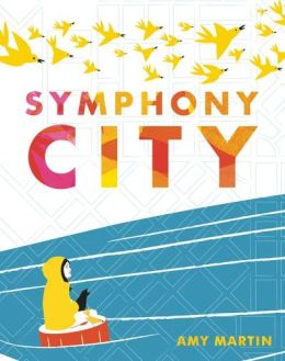 Publisher: McSweeney’s McMullens, 2011
Reviewed by: John Stewig, Carthage College
A pair of books* from a
publisher I didn’t know about, indicates a very impressive commitment to doing
high quality children’s books that are unusual. Each comes with a heavy weight
jacket, which when unfolded reveals a poster which stretches to an impressive
26 ¾ inch square.
In this case, small
vignettes of each of the ten instruments featured later extend and expand
visual ideas presented in the book itself. Removing the jacket for this book,
we see a bright orange cover which features a flock of gold ink birds flying
across the top of the book. Opening to end papers, we are introduced to the
highly saturated colors used by Martin which will appear throughout the text.
The opening of the story
is a fairly subdued beige, highlighted in just a few places with more intense
color as the little girl, bored, sets off on a walk with the adult. She gets
lost and the as color intensifies in saturation when the little girl gets
closer and hears a variety of musicians, a different one on nearly every page.
Highly simplified shapes and enough empty space to provide contrast make this
is a real commitment to quality book making, all enhanced by the quality of the
very heavy matte paper.
While these are
certainly not immediately appealing to a wide child audience, they are well
worth introducing to children. Visual taste, as taste in music, often develops
slowly as result of guided looking or listening. The publisher has made a
calculated commitment to quality book making. Hopefully enough teachers,
librarians, and parents will sense this quality to make more books like this
come from the publisher.
*See other review above
Click here for purchase and inquiries.
Click here for purchase and inquiries.
"Picture a Tree" By Barbara Reid
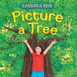
Publisher: Albert
Whitman, 2011
This is an era when purposeful
casualness in approaches to illustration pervades picture book production. It
is therefore a somewhat delightful anachronism to come across another carefully
crafted book by this artist. Reid is virtually alone in her medium, crafting
pictures from colored Plasticine. The amount of detail she produces in any
particular illustration is impressive.
Opening the book we get
a glimpse of her attention to detail in the 40 small rectangles on the end
papers, showing various parts of this book. It is a gentle story, perhaps more
accurately a reflection on the many different kinds of trees (deciduous and
coniferous) and the functions they serve (stimulating the imagination by
becoming a pirate ship or a bear cave). There isn’t really a continuous story,
though in fact the young girl on the concluding opening holding her younger
sibling has appeared on previous openings.
Two particularly nice
touches: one of the double page spreads is split horizontally to show the young
girl seated on a tree branch, the words are “You may see the end of one thing,
or the start of something new.” Above the horizontal split, it’s clearly
summertime but turning the book around, it is equally clear that fall has come
and it’s time to go to school. There are interesting verbal images, “Some trees
put on snow suits.” and we do in fact see the evergreens heavily laden with
snow. There is a final tender touch in the commentary about winter trees
holding spring and the visual image of the little girl her grandfather and the
younger sibling. Kudos to Reid for believing firmly enough in the
expressiveness of her medium, to continue working in it rather than forsaking
it for some other easier-to-manage medium.
Click here for
purchase and inquiry
"Bruno
Munari's Zoo" by Bruno Munari
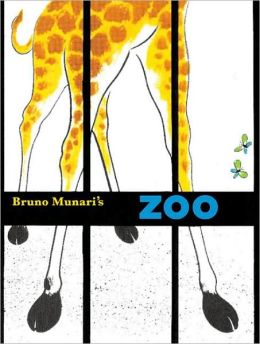 Author: Bruno
Munari
Author: Bruno
Munari
Publisher: Chronicle Books, 2010
Reviewed by: John Stewig, Carthage College
Kudos to the publisher for making available once again an important book in the history of American picture book development. Originally published in 1963, the art remains impressively fresh and arresting to the eye. The informally painted, vividly colored animals create unexpected patterns on pages with much white space for contrast.
The single sentences on
each page are less important than the bold block shapes, which are abstract
rather than realistic. Rather than trying to tell a lot in words about each
animal, Munari strives for a single thought which captures the essence of an
animal.
The page design is
arresting: for the fox, two different width horizontal blue panels splotched
with green bisect the wide lattice-lacy horizontal sweep of fence across the
double spread. Would that some artists today, whose pages weary the eye with
too much detail, could create such minimalist pages to such maximum effect.
Mies VandeRohe was right: "Less is more."
Sometimes Munari
(1907-1998) shows the entire animal (the porcupine) while the lion is depicted
so close up that the head allows space only for part of a paw and two tiny
butterflies.
The crisp white
endpapers are an effective foil for the cover (a different design than the
jacket). The bold black cage bars of the jacket contrast effectively with the
more delicate scale of the restraining cage wire on the cover.
The elegant simplicity
of this book isn't widely emulated in picture books today and it would be
useful to share this with children, asking them to talk about what they see.
Comparing and contrasting this with contemporary books, often full to the page
edge with (often fussy) details, and lacking appropriate white (blank) space,
can expand children's aesthetic sense, albeit intuitively.
Click here purchase and inquiries
"The Song of Francis and the
Animals" by Pat Mora
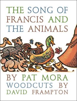 Author: Pat Mora
Publisher: Eerdmans, 2005
Illustrator(woodcuts): David Frampton
Reviewed by: John Warren Stewig, Carthage College
Mora's simple yet graceful retelling of part of the life of St Francis will introduce the saint to young listeners/readers, with the help of a sprinkling of Italian words easy to understand in context, though they are defined in a box of the reverse of the title page. The woodcuts by Frampton continue his long and prolific career illustrating children's books. The expected angularity and the pervasive blackness of the carved lines are suffused with warm hues. The oversized vertical format provides a luxurious context for the art: single, facing pages with plenty of room for a generous surrounding of white, setting off both text and art.
Click here for purchase and inquiries
No comments:
Post a Comment