Current Recommendations
_________________________
“Frieda
and Diego: Art. Love.
Life.” by Catherine Reef
 Author: Catherine Reef
Publisher: Clarion, HMH, 2014
It
is interesting to note that though Frieda
is named first in the title, the first full chapter is about her muralist
husband, Diego Rivera. The book includes twelve
reproductions of his work and only six of hers, perhaps a constraint of
copyright? Setting the varied life this intense couple lived together and apart
and together again, author Reef chose to include nearly 40 archival photographs
showing the people, the environments, and the art which surrounded the couple.
Readers
meet the artists when they are already adults. Before they married, he was
“more than twice Frieda’s size” and “also, at 42, twice her age,” (p.4) perhaps
a reason his family objected.
The
book includes extensive treatment of Diego’s family (parents, aunts, uncles,
and servants.) It also reports on the politics of the time, his student days in
Europe, seeing art and making art. Sent to Italy, supported by the Mexican
government to study, in return, he had to paint murals* in public buildings.
A succeeding chapter describes Frieda’s
similarly large family. Reef offers many charming, small, and specific details.
For example, when confined because of polio, Frieda would breathe a mist on her
window and draw a door.
By
1937-38, Frieda began to be recognized as an artist in her own right, due to
the efforts of writer Andre Breton as he helped her gain status as a surrealist. The author provides more details about each of
the artists’ amorous affairs than many readers will find interesting. The
interaction both of them had over extended periods of time with the rising and
falling fortunes of communism led to their acquaintance with party leaders such
as Leon Trotsky. Toward the end of her life- most of which she spent as an
invalid- Frieda nonetheless made the effort to attend a communist public rally.
In summarizing her importance, Reef reports that Frieda’s paintings reflect “…a
frank depiction of a woman’s inner life.” (p. 118)
The
end matter includes a time line, a bibliography, a large number of
illustrations, both archival photographs and reproductions of art by Kahlo and
Rivera. It also includes works by other artists like Misha Reznikoff,
to set a more complete context for the artists’ works.
_______________________________________________________________________
*The flowering of mural paintings in Mexico grew in the context of intense communist ferments going on and around the world at the time. Two other Mexican muralists who came to prominence at the time were David Alfaro Siqueiros and Jose Clemente Orozco.
*The flowering of mural paintings in Mexico grew in the context of intense communist ferments going on and around the world at the time. Two other Mexican muralists who came to prominence at the time were David Alfaro Siqueiros and Jose Clemente Orozco.
“Everybody
Paints! The Lives
and Art of the Wyeth Family” by Susan
Goldman Rubin
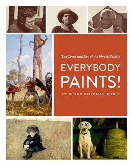
Author: Susan Goldman Rubin
Publisher: Chronicle, 2014
In
1882, N.C. Wyeth, family patriarch, said “art is a thing that has to be studied
right.” This man, whose mentor was Howard Pyle, was
reflecting on the crucial role illustrators played in an age when magazines
were not only popular but pervasive. N.C. apprenticed with Pyle in a class of
only twelve and despite the reputation and financial success of his mentor, he
always felt that illustrators were less respectable than painters. His several
children were encouraged to draw and his son Andrew was home-schooled. This,
perhaps, reflected his father’s view, “No top-notch artist ever graduated from
college.” (p. 35)
Andrew
studied with his tough task-master father but, with his father’s encouragement,
went to Maine and there honed his painting skills. His early work in water
color was succeeded by an interest in egg tempera. The accidental death of N.C.
left the family rudderless. Reflecting his father’s interests, Andrew continued
his realistic paintings as many artists of the time were drawn into abstract expressionism.
In turn, Andrew tutored his son, Jamie, at home and he learned his visual
skills from both his father and his aunt Caroline, who was a very traditional
artist. He later reflected, “It wasn’t very interesting, but it was important.”
(p. 76) Author Rubin raises a question that persists: “[Is] it wrong for an artist
to be popular?” (p. 48)
The
representational art of the Wyeths remains widely popular as other artists
explore less realistic modes of expression, and as a result, some remain
inaccessible to the public. The question
of popularity has also been raised regarding the work of Norman Rockwell.
In a
small, but elegant format, Rubin presents each full-page reproduction
individually on a page so they are large enough to appreciate details. There
are reproductions of paintings and archival photos. Dark-toned papers feature a
variety of colored print. She also selected an interesting contrast in types of
subjects represented in the paintings selected for inclusion in the book. For
example, she chose to include a painting Jamie did of President JFK and another
he did of a pig to show his skill in a wide range of subjects. Extensive end
matter includes bibliography, index, image credits, and locations of the art
works featured.
“The Noisy
Paint Box” by Barb Rosenstock
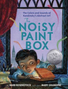
Author: Barb Rosenstock
Illustrator: Mary Grandpre
Publisher: Alfred A. Knopf, 2014
Kudos to this author/illustrator team
for trying to capture the exuberance and energy of the Russian painter, Wassily Kandinsky (b. 1866, d.
1944), in their smaller format on paper.
Everything about the big, bold work familiar to museum goers demands
attention and this book connects his adult work with his childhood.
Little Vasya (to become Wassily later)
was intended to be a “proper” Russian child.
Stiff and straight were the watchwords in his household, aptly depicted
by the illustrator best known for jackets and interior art for the Harry Potter series. Here Grandpre
provides interesting details (the huge fish on a platter, the abacus and scales
in the background), all depicted in somber colors. The bird in the cage is apt symbolism for how
little Vasya feels.
The palette brightens when Auntie
gives him a paint box. As he begins
mixing colors, Vasya begins to hear sounds (whisper, hiss, clink, clanging,
tinkling). Sadly, no one else hears the
sounds, as he splashes colors like “powerful navy” and “blaring crimson” and”
burbling green.” Such a cacophony of
sounds from a little box of paints!
This is the hook that will interest
even children unfamiliar with the artist: being ignored by adults and told to
stop being silly. No one empathizes with
Vasya, and so he grows up to be a conventional adult, until the drive to create
in color the sounds he hears overwhelms him.
Finally freed by the encouragement of his artist friends, he creates something
new: abstract
expressionism. Though widely
acknowledged in the art world, the painting legacy he left is still perplexing
to many adults,
In
the author’s note, Rosenstock
includes thumbnails of four of Kandinsky’s paintings, though they serve as
reference only, as the actual paintings are usually quite large. The author ends on a powerful idea: “Maybe someday you will go and hear them.”
which provides a fitting end to the point she is making throughout.
________________________________
Note: For another review, see The Horn Book January/February 2014 page 116.
“Meeting Cézanne”
by Michael Morpurgo________________________________
Note: For another review, see The Horn Book January/February 2014 page 116.
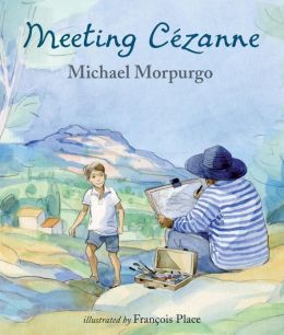
Author: Michael Morpurgo
Illustrator: Francois Place
Publisher: Candlewick Press, 2013
Reviewer: Lizzy Lowrey, Milwaukee Public Library
Part coming of age tale, part story of
mistaken identity Meeting Cézanne is
so well narrated that you would think the author, Michael Morpurgo was writing
about his life. Yannick, a young Parisian, takes a trip to his relative’s house
in Aix-en-Provence and has unforgettable experiences. He falls for his much
older cousin, learns how to make the perfect soufflé and meets the greatest
painter in the world (or so he thinks).
Illustrations weave together the story
and are reminiscent of Paul Cézanne, often using the same color schemes and
landscapes. Francois Place’s art creates a beautiful setting for the story’s
protagonist, Yannick, to learn about life and art. The variations in color and
tone create movement that draws the reader in to examine every inch of the
artwork.
Although small, the book delivers a
powerful story with interesting illustrations. Readers of any age will be able
to relate to fumbling their way through adolescence and experiencing new and
exciting things. Too long to be a picture book, but not quite a chapter book,
older readers may be interested in this story as a read aloud; however, younger
readers may find the formatting too challenging to read.
The connection to Paul Cézanne in this
work of fiction is slight; it does not include many facts or data on the
artist. It does give a glimpse into French culture, with names and places
readers might otherwise not be familiar with. The story mostly focuses on
Yannick and his experiences, and is not bibliographic of Cezanne. It is best
used as a story that contains a little art information, and not the other way
around. The images, however, have the capability to spark an interest in the
great painters in history.
Click here for Purchase and Inquiry.
“Brush of the Gods” by Lenore Look

Author: Lenore Look
Illustrator: Meilo So
Publisher: Random House, 2013
An
author’s note precedes the title page introducing the factual basis for this
imagined life of the artist, Wu Daozi. The book concludes with a brief
paragraph describing the legend that the artist didn’t die but simply walked
into his final painting.
Between
these two pieces of information, the author, Lenore
Look, crafts a pleasant story of the young artist learning at the hands of
a stern old monk, master of calligraphy. As he gained confidence, Daozi was
driven to draw everywhere and what he drew amazed people. In time, his work
amazed himself as one day a butterfly he painted took flight. Over and over
again with bigger animals, the mystery of images becoming animate continues.
Unfortunately, the crowd of his adult fans felt he was bragging and rejected
him. Only the children watched and they became his followers. In the end,
creating his masterpiece for the emperor, an entire palace wall, he is able to
reverse the process and walk into his painting to disappear.
Meilo So’s art is as relaxed as it
has been in the several of her previous books. Here, she presents full-page,
double page spreads, and smaller spot art arranged on pages with type set
above, below, and on the side of her art. She brushes with a freedom and confidence
that belies an underlying masterful technique. Using line only sparingly, she
brings her splashes of color into focus. What results is art that is easily
“readable” ie: understandable but never heavy handed.
An
interesting comparison could be made with “A Young Painter” by Zheng Zhensun
and Alice Low (Scholastic, 1991). This is a biographical account of the early
life of a child whose talent was apparent by the age of three. Both in the
description of how the young artist works but also in end matter which
describes traditional Chinese painting, a section on inscriptions and seals, a
glossary of terms, and a map. An index does help if a reader is looking for
something in particular, but browsing through the reproductions of her
paintings can be done at random with great pleasure.
Click here for Purchase and Inquiry
"The Line"
by Paula Bossio
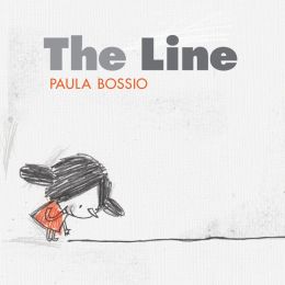 Author: Paula Bossio
The creator of this purposely
scruffy little girl in a red dress has imagined for the heroine a number of
imaginative activities she can do, using just the black crayon line. She slides
down a hill she creates, rolls in a hula hoop, blows soap bubbles, hangs on the
monkey bars, balances on a tightrope. While doing that, she is attacked by a
monster she inadvertently created but is then rescued by another, friendly
bear. The enigmatic last opening shows a little boy in blue, walking off with
his pencil. Was he the one who drew the bear?
Interesting activities with children
might include having them draw and adventure using just a single line. Or, a
group could speculate on the little boy and what he will draw next.
A related title which can offer
interesting comparisons/contrasts is HAROLD AND THE PURPLE CRAYON by Crocket
Johnson (HarperCollins, 1998, 50th anniversary edition)
Click here for Purchase and Inquiry.
"Everything I Need to Know I Learned from a Little Golden Book"
by Diane Muldrow
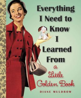 Author: Diane Muldrow
Publisher: Random House 2013.
The author of the preface, in which she describes the compilation
she has created, drew from over 30 previously published Little Golden Books to
make an uplifting, “feel good" book of advice which hangs together much
better than one might expect. The book illustration sources were published
originally in the mass market format which made Western Publishing (at that
time located in Racine, Wisconsin), a household name.
Single and double page spreads vary in time from 1942 through 1963, and were done by well-known illustrators, many of whom went on to fame in book art and other media.
Garth Williams, Feodor Rojankovsky, Gustaf
Tenggren, Leonard Weisgard, and Alice and Martin Provensen are among those included.
Tibor Gergelyis the most often included. No
matter the originating artist, the small books included simplified shapes,
bright colors and a pervasive use of white backgrounds (to crisp up the
colors).
Here the art is linked
together by the way Muldrow has tied visuals from different books and
illustrators, but shared a collection of homey aphorisms to provide an upbeat
message. For example, "Turn off the TV from time to time..." (art by Richard
Scarry) faces the page for "and crack open a book!" (art
by Garth Williams). An additional very valuable resource about this publishing
phenomenon was chronicled by Leonard Marcus in his book “Golden Legacy: How
Golden Books Won Children’s Hearts, Changed Publishing Forever, and Became an
American Icon Along the Way.” (Random House, 2007)
Click here for Purchase and Inquiry.
"Henri's
Scissors" by Jeanette Winters
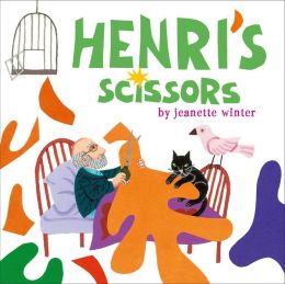
Author: Jeanette Winters
Publisher: Beach Lane Books, 2013
First
with splashes of intense, happy paint and then at the end of his life in
brightly colored cut papers, this French artist (1869-1954) created works which
are easily accessible and widely popular. Here his biographer is a
writer/artist equally at home with color who chronicles Henri Matisse's determination
to create, despite all obstacles. http://www.henri-matisse.net/index.html
Using very simple sentences set
above and below her images, single on facing pages, Winter describes young
Henri observing his mother painting china, and started drawing himself (in
sand, then on his school books). Later, eschewing the study of law, he left for
Paris, where he worked as an artist for years.
An interesting change in page layout
occurs as Winter (http://www.teachingbooks.net/tb.cgi?aid=1117&a=1)
moves into describing Matisse's old age, when illness prevented his usual work.
Instead of the small, contained art earlier in the book, Winter now provides
full and double page art describing how his illness lead to the creation of the
sharp edged but amorphous cut paper shapes which are so well known as the
product of his old age.
End paper quotes about the artist,
as well as an author's note, give further insights into the art work. For more
information about Winter, see patriciamnewman.com.
For another interpretation of the
artist, use Marie Sellier's MATISSE FROM A TO Z (Peter Bedrick Books, 1995). In a small rectangular format, the author includes full
color art, sketches, archival photographs and brief text for words related to
Matisse’s life. Teachers might also find HENRI MATISSE by Albert Kostenevich
(Abrams, 1997) useful in expanding their own knowledge about his work. For a
video to use with children, see artbma.org/flash/fconekids.swf.ady
Click here
for purchase and inquiry.
"A Splash of Red. The Life and Art of Horace Pippin"
By Jen Bryant
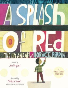 Author: Jen Bryant
Publisher: Knopf, 2013
A new Book by
Caldecott Honor winner Sweet is always a special treat to be enjoyed. Whether
it is her imaginative page arrangements or her refreshing use of white space,
there is always something to delight the eye. The double page spread depicting
visually the account of Pippin’s wounding in World War I is an interesting
visual contrast to the positiveness of the rest of the art.
The artist, born
in 1888, grew up from a childhood delighted with drawing to later life
acknowledgement on his importance as a self taught artist. Fortunately he
overcame his war injury and went on to create paintings which attracted the
attention of the more famous N.C. Wyeth. Wyeth was in a position to offer a
helping hand to this black artist. The book ends with a historical note, an
author’s notes and an illustrator’s note. Sweet’s closing end paper juxtaposes
some of his paintings over the map showing where some of Pippin’s works are on
display in major art museums.
Click here for Purchase and Inquiry.
"Lincoln's Gettysburg Address" By
James Daugherty
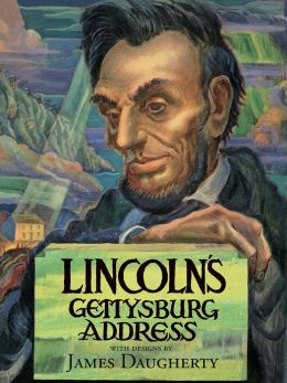
Illustrator:James
Daugherty
Publisher: Albert Whitman, 2013 (1947)
Publisher: Albert Whitman, 2013 (1947)
What a gift to have this new edition
of text and art, both of which are probably unfamiliar to most children and
many adults. Lincoln’s words were crafted 150 years ago, and though Daugherty
was one of the most popular artists of his day, he is not well remembered
today.
The full color jacket of
Daugherty's art wraps around an elegant medium blue cloth color with
the title in gold. Dark blue solid color endpapers are a vivid contrast to the
full color art. The publisher has done an impressive job of presenting these full
color paintings on coated paper with wide white margins which intensify the
highly saturated colors. The 12"h by 9 1/4"w format opens to a full
17 1/2" wide double spreads in the realistic style characteristic of the
artist's work.
There is an interesting reflection
of the time this work was originally published; In the double spread for the
part of the address, “The brave man living and dead…” the men are depicted in
World War 2 uniforms.
Daugherty's original forward to the book
follows his designs for the half title and full double spread title. An
afterward by a professor of Civil War studies, Gabor Boritt, describes the
context of the situation in which the address was given. A facsimile of the
address in Lincolns own handwriting is included. One of the most interesting
aspects of the book is the end matter, Daugherty's interpretations of each of
his paintings.
"Diego Riviera:
An Artist for the People" By Suzanne Goldman Rubin
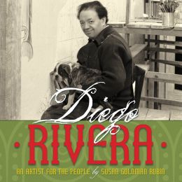 Author: Suzanne Goldman Rubin
Publisher: Abrams, 2013
In a large scale format (10” H by
20” W), the author is able to include double spreads for instance, one of the
murals at the Detroit Institute of Art. Several other full color reproductions
of his work are included. A full page reproduction of a fresco by Giotto and
another of a well-known painting by Velazquez shows the important historic
influences on the artist’s work. Archival photographs set the account of the
artist’s life in his times. There are extensive end notes about the history of
Mexico, about Rivera’s artistic influences, as well as a glossary, source
notes, and bibliography. The reoccurring swirl background motif on the interior
pages, as well as on the end papers, capture some of the vigor of his
paintings. Author Rubin handles the artist’s adventurous personal life with
discretion.
Click here for Purchase and Inquiry.
"Mary Nohl. A Lifetime in Art" By Barbara Manger and
Janine Smith
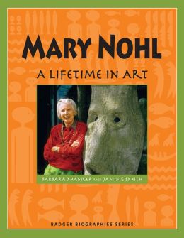 Author: Barbara Manger and Janine Smith
Publisher: Wisconsin Historical Society, 2013
Intended for an intermediate or middle school reading audience,
this briefly surveys an unusual women artist’s resolutely individualistic determination
to live as an artist, exploring a wide variety of artistic mediums. The series
itself, in small paperback format, features other artists like Frank Lloyd
Wright (see review in this blog) and musician Les Paul, in addition to some
other less well known Wisconsin-ites.
A large variety of black and white photographs, both of the art
works and of Nohl’s environment, precede an appendix in color showing other of
her works. Additional archival photos of the outdoor environments in which she
placed her sculptures are also included. The book is clearly intended through
its pronunciation key and its glossary to be self sufficient, defining such
things in bold face as color chart,chandelier, and ancestor. Done consistently throughout the book, this does seem to
be a bit pedantic after a while. It is however true that such words as casein, egg tempra and surrealism,
may well be unfamiliar to most child readers.
Click here for Purchase and Inquiry
Previous Recommendations
_________________________
"Think Big." By Liz Garton Scanlon
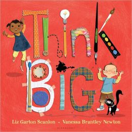 Author: Liz Garton Scanlon
Publisher: Bloomsbury, 2012
Illustrator: Vanessa Brantley Newton
So few words and
yet so many ideas presented so positively. From the opening end papers, viewers
get the idea that we are to encounter a wide variety of art media. The pair of
budding imaginers’ explores paint: purple hand prints are such fun! On the next
opening they try out an array of musical instruments. Even the black cat that
appears throughout picks up drumsticks. As the exploration continues the pair
of children explore dramatizing, cooking, singing, sewing, pottery making,
dancing, and knitting. These all lead to a final performance, a result of their
making art. The art throughout is as carefree as the child creators, who are
blissfully unaware of any technical limitations. They simply dive in and take
part, an unspoken encouraging message to children.
Scanlon’s
penchant for creating important messages in minimal amounts of language is also
available in All the World ( ill.
Marla Frazee). Beach Lane Books, 2009. This appreciation of the delights of the
natural world encourages children and adults to explore through all their senses.
"A Disney Sketchbook" by Ken Shue
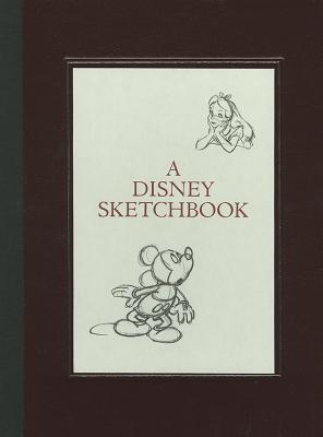 Author: Ken Shue
Publisher: Disney Editions, 2012
Additional
information, and a brief history of animation by Charles Solomon, an animation
critic and historian, preceed this extensive array of sketches. These are
presented in a large ( 9 3/4"2 x 13'h) format on matte paper. Some pages
include several smaller sketches, other pages feature a single image on a page,
with sufficient white space to showcase the details. Perhaps because sketches
are intrinsically initial in a long process to a finished product, there is no
documentation of individual artist or film title as in the book by Lassater
(also reviewed here). This does not diminish the value of this collection for
an aspiring artist.
"Hanging off Jefferson’s Nose" by Tina
Nichols Coury
 Author: Tina Nichols Coury
Illustrator: Sally Wern Comport Publisher: Dial, 2012
Four hundred men were needed to create the four men. Gutzon Borglum had no trouble thinking big though it fell to his son Lincoln to finish the mammoth mountain sized presidential sculptures. Hewne out of the granite in South Dakota, these were not the first idea the sponsors of Mount Rushmore had in mind. As the idea evolved, Gutzon was able to add a fourth figure, of his friend Theodore Roosevelt. Workmen needed to build a staircase of 500 steps to climb to the top of the mountain. The story here concentrates more on the people, processes, tools and weather constraints than on the artistic nature of this endeavor.
Four hundred men were needed to create the four men. Gutzon Borglum had no trouble thinking big though it fell to his son Lincoln to finish the mammoth mountain sized presidential sculptures. Hewne out of the granite in South Dakota, these were not the first idea the sponsors of Mount Rushmore had in mind. As the idea evolved, Gutzon was able to add a fourth figure, of his friend Theodore Roosevelt. Workmen needed to build a staircase of 500 steps to climb to the top of the mountain. The story here concentrates more on the people, processes, tools and weather constraints than on the artistic nature of this endeavor.
The front jacket shows the scale better than words could.
Endpapers introduce the location (front opening) and depict the result (back
opening). Inside, Comport’s borderless double page spreads, which stretch to
the edge, are painted in strong brown tones. These are realistic enough to
create the time and place in pleasantly impressionistic style. The extensive
text is placed in various locations.
Click here
for Purchase and Inquiry.
“Six Men” by David
McKee
Author: David McKee
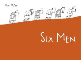 Publisher: North South, 2011
The author/illustrator, whose career
spans nearly 50 years of published work, is perhaps best known for his work
brightly colored, highly geometrically patterned art, featuring Elmer the
Patchwork Elephant. This pachyderm has won the hearts of children who delight
in the simple stories.
Here, McKee turns his attention to a
serious allegory. The new book is indeed, as dictionaries tell us, “abstract
meaning presented through a concrete form.” The six men are sharply
differentiated as they go around the world looking for a place “where they
might live and work in peace.”
The
men at first succeed, until their worries about unknown enemies lead them to
greater and greater heights of folly. Indeed, this escalates to a point where
there are actual enemies facing each other across the great river. At the end
of this confrontation, there are just six men on either side who turn away to
resume their original search.
The
sharpness of the ink pen lines juxtaposes many different patterns, though there
are large areas of blank space in a contrast that sets off the details. Some of
the art is conventionally arranged on the page, i.e. the viewer looks directly
at eye level, but in several cases, McKee takes an unusual view point.
Sometimes the viewer must look top down, sometimes look closely at the tiny
figures in panoramic views, and in one of the openings must figure out the
split screen effect. All of this is done without the saturated color so
characteristic of much of McKee’s work. Indeed, he even eschews shades of gray.
All we have is simple, intense, sharp line to provide an equally sharp comment
on the folly of war.
“Rapunzel” by Sarah Gibb
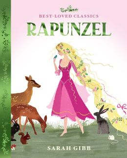 Author: Sarah Gibb
Sarah Gibb presents an elegant
vision of a pleasantly traditional retelling based on the Brothers Grimm. At a
time when fractured fairy tales are commonplace (The Really Groovy Story of
the Tortoise and the Hare, same publisher, 2011) it is refreshing to find a
beautifully produced and effectively written presentation, no gender
transformation or setting/drastic time change needed.
This presentation is interesting
because of Gibb’s extensive use of silhouettes accompanying full color pastel
art which bears a pleasant relationship to the antecedent work of Leonard
Weisgard done during the 1940’s and 1950’s. The art is arrayed in various
places on the page, from small vignettes set between blocks of text above and
below to double page wordless spreads. Throughout, the generous use of white
space enhances the elegant effect. Several of the pages feature effective cross
sections which help to advance the storyline. Full page, and a double page
wordless spread contribute to a leisurely retelling. The variety of pastels
contrast with the inky black of the silhouettes and patterns abound for
children who enjoy searching out details.
The book, first published in
Great Britain in 2010, represents an interesting publishing direction for
Whitman, better known for books designed to help child readers deal with
various problem issues. A commitment to making traditional tales such as these
available to children today is important, when few publishers are doing so.
"Layout and Background: Fourth
Volume in 'The Archive Series'" By
John Lassater

Author:John Lassater
Publisher: Walt Disney Press, 2011
An elegantly oversized
format, on a coated paper with a trim size that opens to a nearly 25 inch
horizontal opening. This provides ample room for the reproduction of the art
from a variety of movies, stretching from 1928 to 2011, arranged
chronologically. A variety of page layouts allow for some full page, double
spreads, smaller pieces grouped together and gatefolds.
End matter includes
black and white photographs of the some of the artists, an art credits list
(indicating that many pieces were created in the studio and artists not
acknowledged), an index and an acknowledgements page, telling a bit about the
archive itself.
Click here for Purchase and Inquiry.
"Vincent Van Gogh and the Colors of the Wind" By Chiara Lossani

Publisher: Eerdmans Books, 2011
Beginning the story when the artist
was a child, the author follows through to the abrupt tragic ending of his
relatively short life. The opening includes a description of Van Gogh
(1853-1890) running through the open fields, mouth open “As if to swallow the
wind.” The contrast between the two red haired brothers, so alike and so
different is carried throughout the entire book. Though the book includes a lot
of information the language was actually marked by its lyrical nature. The
wind, (called Mistral in Provence where Van Gogh lived) becomes almost another
character with the verbs including murmurs,
howls, and cries. At the beginning it is a joy to the artist and it continues
giving him directions throughout his life. It serves as a help as the author
says, “The wind caresses his hair, blowing away these dark thoughts one by
one.” The author’s language includes such similes as thorn bushes rise like
charcoal sketches, and she comments elsewhere that the colors chase each other
like words in a speech.
Two men exerted considerable
influence on Van Gogh. The first, his brother Theo, believed in his brother’s
talent and worked to support that belief by action throughout the artist’s life
though in fact when Van Gogh died only one of his paintings had been sold. The
second important influence was Paul Gauguin (WEBSITE) with whom Van Gogh spent
a brief trial sojourn sharing a house. This attempt was destined to fail as the
author comments, “Can two volcanoes stand side by side without causing a
calamity.” Part of the attraction of these surrealistic of the full page
paintings is their interesting juxtaposition of elements. For example one page
combines the painting of Gauguin’s chair when Vincent returned to discover
Gauguin’s had moved out. The reproduction of Gauguin’s painting depicting
himself juxtaposes a huge chair, the painting Van Gogh did of Gauguin. The size
contrasts depict visually the abandonment Van Gogh felt which is also described
in the words.
The artist uses tall vertical
rectangles with both double and single page spreads. She combines in
interesting fashions small actual reproductions of 14 of the artist’s original
paintings along with art that evokes a sense of magic realism. The art is very
thoroughly painted with white spaces being nearly absent. The book opens with a
double end page including a specific list of the paintings, dates and
biographical information acknowledging the author’s source primarily letters
between Van Gogh and his brother Theo. Originally published in Italy, this is a
very text-heavy picture book perhaps reflecting a European culture which
expects children to be able to handle more texts than American publishers
typically publish?
"Picture a Tree." By
Barbara Reid
Author: Barbara Reid
Publisher: Albert Whitman, 2011
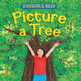
This is an era when purposeful
casualness in approaches to illustration pervades picture book production. It
is therefore a somewhat delightful anachronism to come across another carefully
crafted book by this artist. Reid is virtually alone in her medium, crafting
pictures from colored Plasticine. The amount of detail she produces in any
particular illustration is impressive.
Opening the book we get a glimpse of
her attention to detail in the 40 small rectangles on the end papers, showing
various parts of this book. It is a gentle story, perhaps more accurately a
reflection on the many different kinds of trees (deciduous and coniferous), the
functions they serve (stimulating the imagination by becoming a pirate ship or
a bear cave). There isn’t really a continuous story, though in fact the young
girl on the concluding opening holding her younger sibling has appeared on
previous openings.
Two particularly nice touches: one
of the double page spreads is split horizontally to show the young girl seated
on a tree branch, the words are “You may see the end of one thing, or the start
of something new.” Above the horizontal split, it’s clearly summertime but turning
the book around, it is equally clear that fall has come and it’s time to go to
school. There are interesting verbal images, “Some trees put on snow suits.”
and we do in fact see the evergreens heavily laden with snow. There is a final
tender touch in the commentary about winter trees holding spring and the visual
image of the little girl her grandfather and the younger sibling. Kudos to Reid
for believing firmly enough in the expressiveness of her medium, to continue
working in it rather than forsaking it for some other easier-to-manage medium.
Click here
for Purchase and Inquiry.
“Leonardo da Vinci” by Steve Augarde
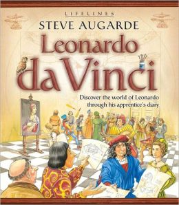
Author: Steve Augarde
In a helpfully large format (10 ¼ x
11 ½“) the author/illustrator presents the fictionalized account by Paolo of an
apprentice’s life in an art studio in Italy. There are 17 entries in
his“journal” spread over six month of 1490, with two more following eight years
later, when he was –at 18 years of age- and established artist in his own
right. Accompanying these fictionalized diary entries are brief margin
paragraphs providing additional factual details.
The fully painted art features
double page spreads as well as others where facing pages feature several small
vignettes giving a few details of costume, architecture and other details of
daily life in 15th century Italy.
At the conclusion of the imagined
narrative, there are nine following sections on such topics as “What Happened
Next?” “The Heart of Europe” and “People and Power.” Continuous text in these
sections is helpfully broken into briefer segments, accompanies by line
drawings and full color, as well as black and white photographs. The book
concludes with a glossary and index. This is an effective presentation about
the studio operation and artistic output of Leonardo, set in an effectively
wide look at the context of the times.
As
an introduction, this most recent book in a series of biographies for young
readers serves the admirable purpose of introducing children to an art form and
one of the most significant practitioners of it. The series is wide ranging,
including a book about a woman doctor who was the leading force in building a
rural hospital, and another about those clever men who started a motorcycle
company known world wide yet today.
“Yellowstone Moran. Painting the American
West” by Lita Judge
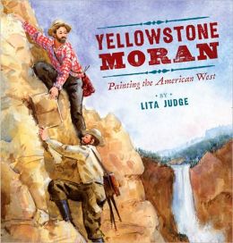 Author: Lita Judge
Publisher: Viking, 2009
Before photography became commonplace, artists created visual
“reports,” documenting people, places, and events. Thomas Moran, a young artist
who had done magazine illustrating, was determined to record the vast beauty of
the west when he heard about an expedition. In 1870 he convinced Dr. Hayden,
the leader, to let him accompany a group of explorers going to the Rocky
Mountains. Large double spreads are at times embellished with smaller landscape
vignettes and fragments of sentences from Moran’s journals. Hot springs,
waterfalls, perilous ravines: this was not the sheltered environment in which
painters of Moran’s era customarily worked. The book includes only one
reproduction of a Moran painting, but Judge’s energetic watercolors capture the
challenging terrain and lead effectively into the actual painting. Map
endpapers, an author’s note and bibliography will be helpful to young readers
intrigued by the area.
"An Eye for
Color. The Story of Josef Albers" by Natasha Wing
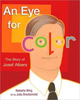
Author: Natasha Wing
Illuistrator: Julia Breckenreid
Publisher: Henry Holt, 2009
Wing’s book moves from when Albers
was a young child through his recognition as a premier explorer of color
theory, but it never gets bogged down in too many details. In a text as
minimalist as the artist’s paintings, some pages have five sentences, others
give a single page to only two words.
As a German child, Albers was
intrigued with his father’s practical art and as a college student, he searched
out unusual art materials. Coming to America in 1933, he subsequently visited
Mexico, which proved inspiration for the color paintings he did the rest of his
life.
On
every spread, Breckenreid’s color shows in bold images the ideas Albers was
exploring. The illustrator’s bold abstractions lead to pages showing how Albers
explored the effects of color on one another. Because of the nature of Albers’
work, the illustrator can recreate it, without the need to actually reproduce
any of the artist’s original work.
The simple book text is augmented
with an Author’s Note, “More About Josef Albers,”a glossary, and a
bibliography. A page of activities which is included would be helpful to a teacher
in leading children to discover some of Albers’ ideas.
Click here
for Purchase and Inquiry.
“Tell Me a Picture” by Quentin Blake

Author: Quentin Blake
Publisher: Millbrook Press, 2003
Blake’s
reputation was firmly established through his connection with Roald Dahl’s books which were actually
part of a much larger oeuvre he accomplished while heading the Illustration
Department at the London Royal College of Art. The book opens with an
introduction by the director of the national gallery and a brief explanation by
Blake about how he chose the pictures he wanted to include and why he decided
to use an alphabetic organizational structure. This paperback book, designed as
an accompaniment to a museum exhibit, would need mediation to be used with
children as it operates on several different levels.
On one level, we follow his usual, purposely, scruffy gaggle of
children as they interact with or comment on a variety of reproductions of
artwork by several different artists. On another level, one can simply look at
each of the 26 reproductions and think about our own reactions to them. Some of
these reproductions (in color and mostly full-page) draw the children along from
“A” for Hendrick
Avercamp, a Dutch artist, to “Z” for Elizabeth Zwerger, a
Viennese illustrator who continues to be very popular today. The mix of
illustrations by children’s book artists and by more conventional painters
functions very well together and represents a span in time from 1460-1997.
Appended to the end of the book is both his quirky additional word of
explanation as well as a glossary featuring a small thumbnail and description
about the artist and the individual piece of work.
What to do with children? Perhaps leaving it available in the
classroom and ask children to choose their favorite picture and focus in on the
choice when the chooser tells the class why it appeals. Or lead the group as a
whole through one picture a day and as Blake’s children comment about the
pictures, have children in the class add further reactions.
Click here for Purchase and Inquiry.